This blog was authored by Veronica Valeros (@verovaleros) on 2019-06-03.
This blog post aims to cover the basics of Splunk: what it is, how to search, how to make graphs, and some interesting searches that can be used to identify suspicious activity on the network.
What is Splunk?
Splunk [1] is a web-based software designed to work with big data. It is used to ingest a myriad of data formats, and it’s optimized to search, monitor and analyze that data.
Splunk is a very powerful tool, and in our case, the three main components are: data ingestion, data search, and data visualization. While Splunk is paid, you can use it for free with some heavy limitations and if you keep your data ingestion below 500MB per day [1].
Overview of Splunk data ingestion capabilities and core functionality. Source: https://www.edureka.co/blog/splunk-tutorial
How to run your own Splunk?
There are two easy ways to try Splunk. One of them is using Splunk Cloud [1], in which users have a free trial for 15 days and a maximum upload of data of 5GB. The second easiest way to get your own instance of Splunk running is to do it using Docker.
The command below will quickly create and start a new docker container with Splunk ready to use:
docker run -d -v [host-folder]:/[docker-folder/ -p [host-port]:8000
-e "SPLUNK_START_ARGS=--accept-license" -e "SPLUNK_PASSWORD="
 --name MySplunkInstance splunk/splunk:latest
Few minutes after the Splunk container is created, it is possible to access the new splunk instance from any browser in the port indicated (host-port). And that’s it. You login with the credentials you provided when the docker was created. Note that as with any other docker container, you need to make sure your firewall is configured to allow external access.
Getting Started: Splunk UI
Search & Reporting view in the newly created Splunk instance. The basics elements highlighted in the image are: 1. Main menu to administer the instance, 2. Search bar, 3. Time range picker, and 4. Search mode menu. A more detailed and granular explanation can be found in Splunk Docs [2].
Splunk is developed in a modular way by what are known as apps. The image above shows the view of the main app known as ‘Search & Reporting’. The key elements highlighted in the above image are:
Main menu to administer the instance: data indexing, configurations, etc.
Search bar: this is where your Splunk search queries go.
Time range picker: this time range applies to the results of your queries.
Search mode menu. There are three different search modes that condition the resources Splunk will use to show you the results of your search query:
Fast search: consumes low resources, it’s fast, only shows what you strictly search for. Recommended for using when visualizing or processing statistics.
Smart search: consumes more resources than the Fast search, but shows you all related fields associated to the search query you did. Recommended for normal use.
Verbose search: consumes much more resources as it shows not only what you searched for but it makes all the data available as well. For instance, if you do a visualization in Verbose mode, the statistics and data table will also be available. If you do the same search in any other mode, the statistics and data table will not be filled. Recommended when doing special operations or debugging visualizations.
Before we move into the search part, let’s first ingest some data.
Indexing of data
In Splunk data is grouped in indexes, hosts and sources. Here’s a small tl;dr:
INDEX: an index in Splunk is like a repository of data. There are default indexes that can be used when uploading data, but it is better to create your own.
To create a new Index go to Settings > Indexes > New index.
Fill the name ‘mydataindex’ & click ‘Save’.
Note: at this moment of getting started this will be enough and we will not get into details of the possible configurations of the indexes.
HOST: a host in Splunk indicates where the data comes from. You can send data from multiple sources to the same splunk instance. We will get back to this shortly.
SOURCE: the source indicates the actual source of data, the filename of the file that was uploaded to Splunk. Eg.: source=/docker-folder/2019-06-03-mydata.txt.
Data inputs: let’s upload some data
There are many ways of adding data to Splunk. To keep it simple, we will use one of the two following methods:
First option: uploading a file directly from our computer.
Second option: monitoring a folder in the docker container. This is more flexible as later we can just put any data there and it will be automatically indexed.
A new data inputs can be added from Settings > Add Data > Upload. In our case, we are working typically with netflows [3] generated by Argus [4]. The flows are generated using CSV format which can easily be parsed by Splunk.
It is possible to download netflows to test from our Malware Datasets, i.e.: https://mcfp.felk.cvut.cz/publicDatasets/CTU-Malware-Capture-Botnet-351-1/. The file with the CSV netflow in that case is called 2018-05-03_win11.binetflow.
Note: if you want to have a smooth upload and parsing experience, just rename the file to 2018-05-03_win11.csv and Splunk will automatically recognize the columns. If you upload the .binetflow, you can still specify the type of data in the next stages (Source type > Structured > csv).
Continue the process making sure the data format is correct and that all the columns are interpreted (see figure below). In the ‘Input Settings’ make sure you specify a host name and the Index that was created before (mydataindex).
Splunk is able to interpret a wide variety of data formats. In this case, the file 2018-05-03_win11.binetflow is being uploaded and the Source type is specified manually as CSV. The columns are then recognized and parsed automatically.
Viewing results: fields, time, table
Splunk can show the data in many different ways. Let’s configure the interface so we have the best experience:
Go back to the Search & Reporting app.
Go to All Fields and select the fields you want to see in the order you want to see them.
My preferred order: SrcAddr, Sport, DstAddr, Dport, Dur, Proto, TotPkts, TotBytes.Go to ‘List’ and select ‘View Table’. This will only show the fields you selected.
Time: you can select and filter by presets the amount of time to show you data from (last 24 hours, or last 30 days, etc.). In our case, depending how the data was indexed (our .binetflow file was some months old), you may want to select ‘All time’.
Let’s do some searching
For searching we first need to specify the index where our data is located. All our queries will start with the index.
If you enter the following query in the Search Bar, select ‘All time’, ‘Smart Mode’, and hit search you should see results:
index=mydataindex.
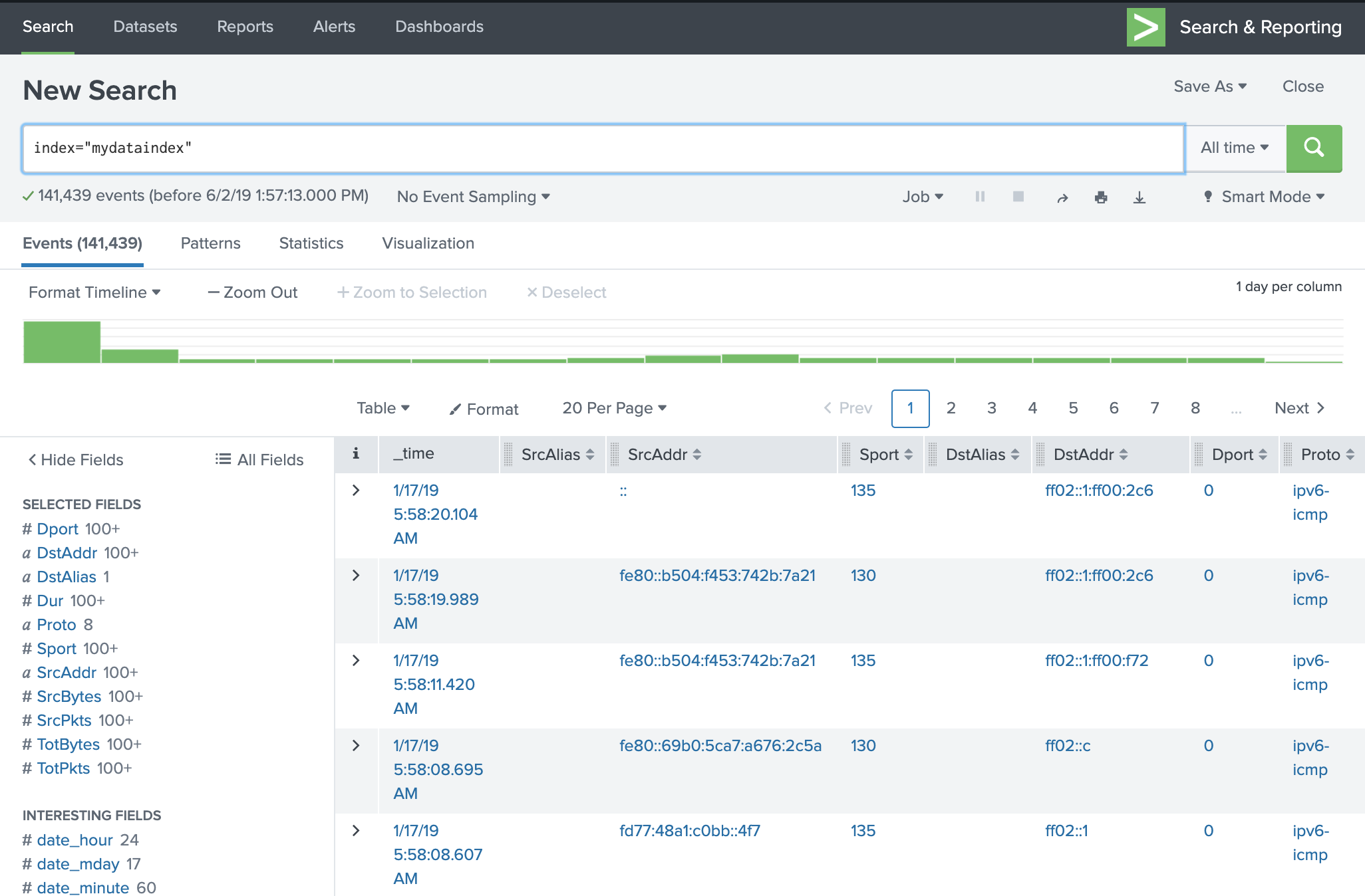
If everything went successfully, your data should look like the image below:
Search & Reporting view after the data was successfully uploaded and the fields were configured.
Searching in Splunk is quite intuitive for the most part, however, it really depends on how the data is structured. Below are a series of queries and examples on how to get started.
Basic Searches
List all the flows that use UDP:
index="mydataindex" Proto=udpList all the flows that use UDP or TCP:
index="mydataindex" (Proto=udp OR Proto=tcp)List all the flows with Total Bytes bigger than 1000:
index="mydataindex" TotBytes>1000
Statistics
In Splunk results of a search can be sent to a function using the symbol “|”. This can be used successively similarly as in Linux.
Calculate the average Total Bytes per source IP:
index="mydataindex" | stats avg(TotBytes) as Bytes by SrcAddrCalculate the average of Bytes Sent per source IP. The bytes sent are calculated resting the TotalBytes - SrcBytes:
index="mydataindex" | stats avg(eval(TotBytes-SrcBytes)) as Bytes by SrcAddr
Splunk has all the standard mathematical functions at our disposal. For a complete list, check the Splunk docs [1].
SORT RESULTS
The sort function uses symbols + and - for ascending and descending respectively. Some functions can also be nested, like in the example below the function avg (average) will take as an input the result of eval (evaluating) TotBytes minus SrcBytes.
Sort the above statistics by Bytes descending:
index="mydataindex" | stats avg(eval(TotBytes-SrcBytes)) as Bytes by SrcAddr | sort -BytesUse the sort to limit the number of results you display:
index="mydataindex" | stats avg(eval(TotBytes-SrcBytes)) as Bytes by SrcAddr | sort limit=10 -Bytes
The term ‘as’ is used to place aliases on terms for facilitating their reference in later parts of the query. Also the sort function can be used to limit the number of results displayed, in this case the limit is 10.
Chart vs Timechart
There are two main ways of visualizing data: using chart or timechart. Timechart is always time based. The x-axis will always be time. In contrast, with chart, we can choose what the x-axis and the y-axis are. Here are some basic examples:
Use chart to create a column chart of total bytes by destination IP, limiting the results to 10 and sorting in a way that will highlight the top destinations:
index="mydataindex" | chart sum(TotBytes) as Bytes by DstAddr | sort limit=10 -Bytes
After executing this query Splunk will show you the statistics. Click on visualizations to choose your desired chart type. The above query, displayed as Column Chart, is shown below:
Give more granularity to the above query. We want to know not only the top destinations, but also the top services contacted per destination IP:
index="mydataindex" | chart sum(TotBytes) as Bytes by Dport, DstAddr useother=f
| sort -Bytes limit=10
The ‘useother=f’ will force Splunk to show all the entries of the data and not group them in an ‘OTHER’ category when there are too many entries. The resulting graph show look similar to the image below:
The above image can be improved if the Column Chart is ‘stacked’ (Format > Stack Mode > Stacked).
Geo Map
Sometimes is useful to graph the countries contacted by a host. We can use Splunk libraries for that:
index="mydataindex" |iplocation DstAddr |geostats latfield=lat longfield=lon sum(TotPkts)
Conclusion
Splunk is a very powerful tool that is useful to have at hand for multiple reasons, whether you are a network analyst or a machine learning researcher. It has obvious limitations, mostly in the free versions, but has some clear benefits and it is very simple to use. A well known alternative to Splunk is Kibana [5], however in my personal experience is not as intuitive and flexible as Splunk.
In this blog we covered the basics of how to get a new Splunk instance up and running, how to ingest data from our computer, and some useful basic search queries. Splunk queries can get really complex but they mostly depend on the type of data and what the needs are.
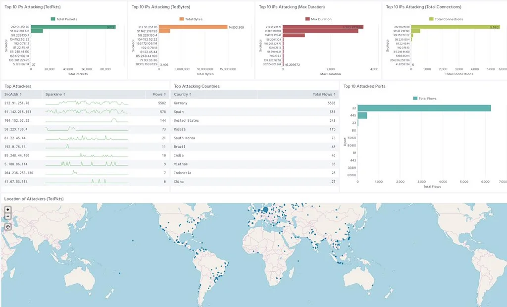
Finally, every visualization or statistics table can be saved into a Dashboard. This is quite handy for event monitoring and gaining visibility on network events. The image below is a dashboard created to monitor one IoT honeypot in our Stratosphere Aposemat Project.
A monitoring dashboard created for one of the IoT honeypots of the Stratosphere Aposemat Project.
References
[1] Splunk, https://www.splunk.com/. Accessed on 2019-06-02.
[2] About the Search App, Splunk, https://docs.splunk.com/Documentation/Splunk/7.2.6/Search/WhatsinSplunkSearch. Accessed on 2019-06-02.
[3] NetFlow, Wikipedia, https://en.wikipedia.org/wiki/NetFlow. Accessed on 2019-06-02.
[4] Argus Network Auditing Tool, QoSient, https://qosient.com/argus/. Accessed on 2019-06-02.
[5] Kibana, https://www.elastic.co/products/kibana. . Accessed on 2019-06-02.


